Maximizing space is a top priority for most people living in HDB or small homes and it is not always easy to find a perfect balance between form and functionality all the time. It requires plenty of care and often you do need to compromise a touch on the colors you use for shaping the backdrop. One of the most popular and easiest ideas in this regard is the use of white to create a beautiful modern interior space as they can easily adapt to varying styles. Before you begin decorating, you probably have so many questions like, What colors pair well with a milky-hued home? How do you create visual interest and break up the monotony? Which furniture styles suit the ivory aesthetic? So here we have gathered some tips and tricks which will answer all of your queries related to white interior design.
Once you land on the perfect white hue, it’s time to introduce some color into the space. When it comes to pairings, there are three palettes you can choose from. The Complementary palette: Pair any two colors opposite each other on the color wheel. Then Split complementary palettes by taking one color, and matching it with the two colors adjacent to its complementary color on the color wheel. Next is the Tonal color palette: Decorate a space using tones from the same color family (i.e., all gray or all blue).
In addition to selecting the right shade of white, you should also consider the lighting in your home. This is crucial to keep in mind because the shade you liked in magazines or online may look quite different in your home. A space with lots of natural light is likely to look warmer, so you can use white light or a cooler shade of warm lighting to balance the room. Rooms that are artificially lit with LED or fluorescent lighting can look cool, so go for a warmer tone of white paint.
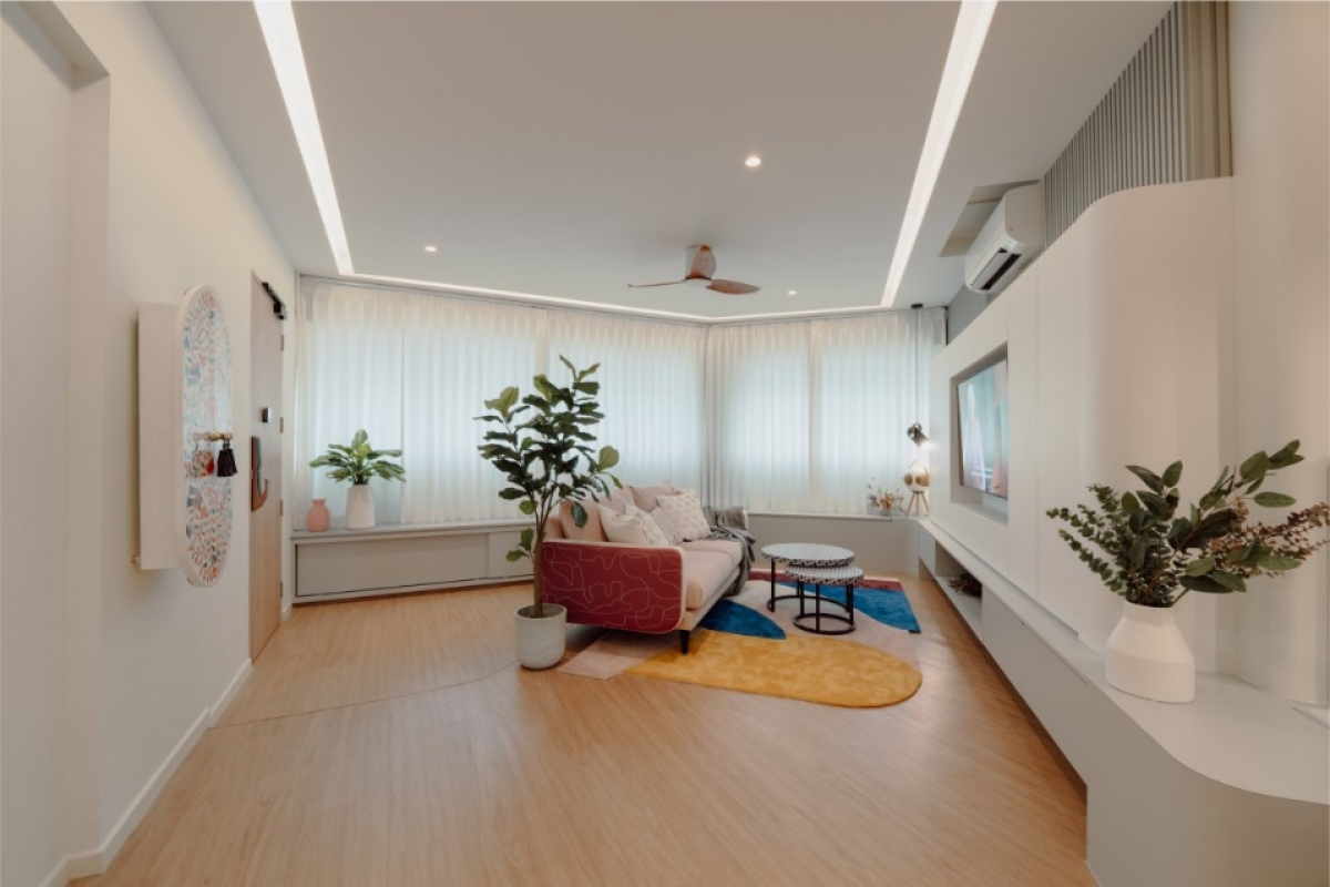
You may agree that there are rarely any white interior design we don’t like. Some people while styling their own white rooms don’t take the risk of coming out of neutral color palette. A little bright pop in any space, adds much-needed depth and variation. Just like you see in this living room design, here the colors in rug and sofa are focal point. Simple solution is by following the rule of 60-30-10 for striking the perfect balance.
Sixty percent of your room is made up of the primary color palette—think the largest surface areas, such as floors, walls, ceilings, etc. Then 30 percent is the secondary palette, so this is for the furniture and soft furnishing elements of the space. Then 10 percent is your accent color or the pop of color.
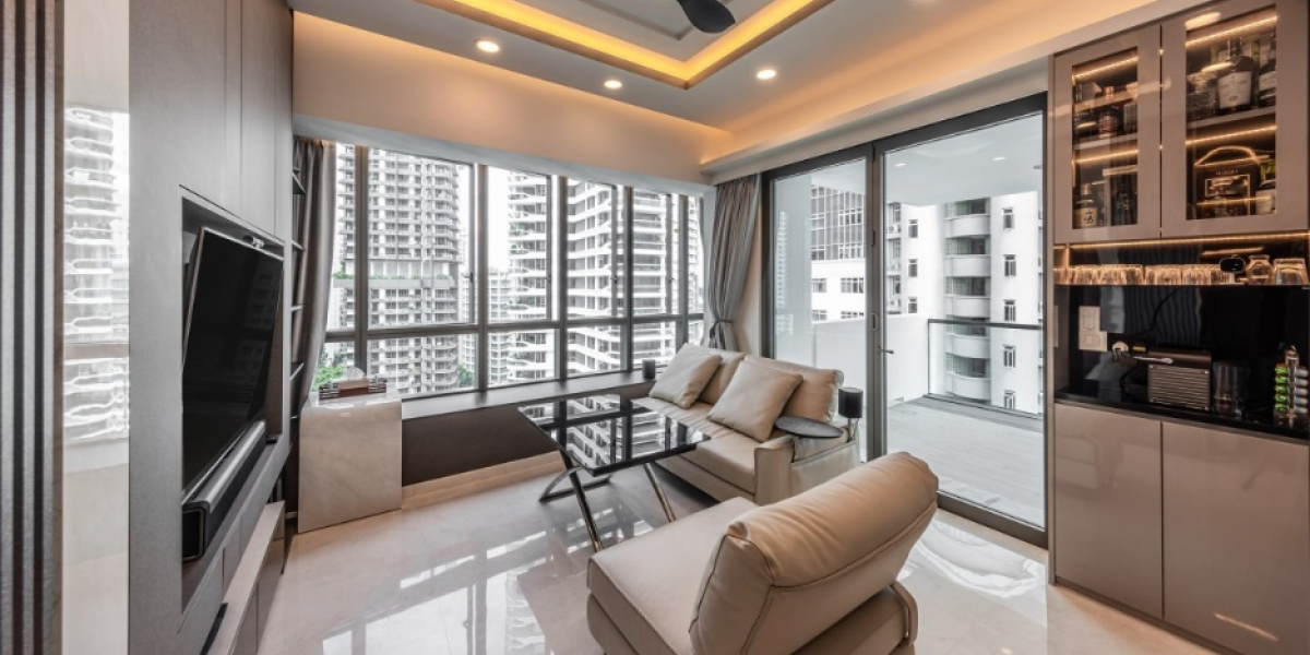
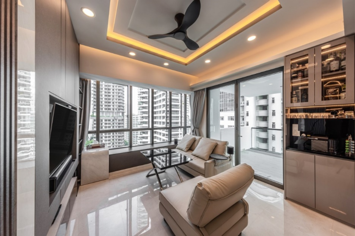
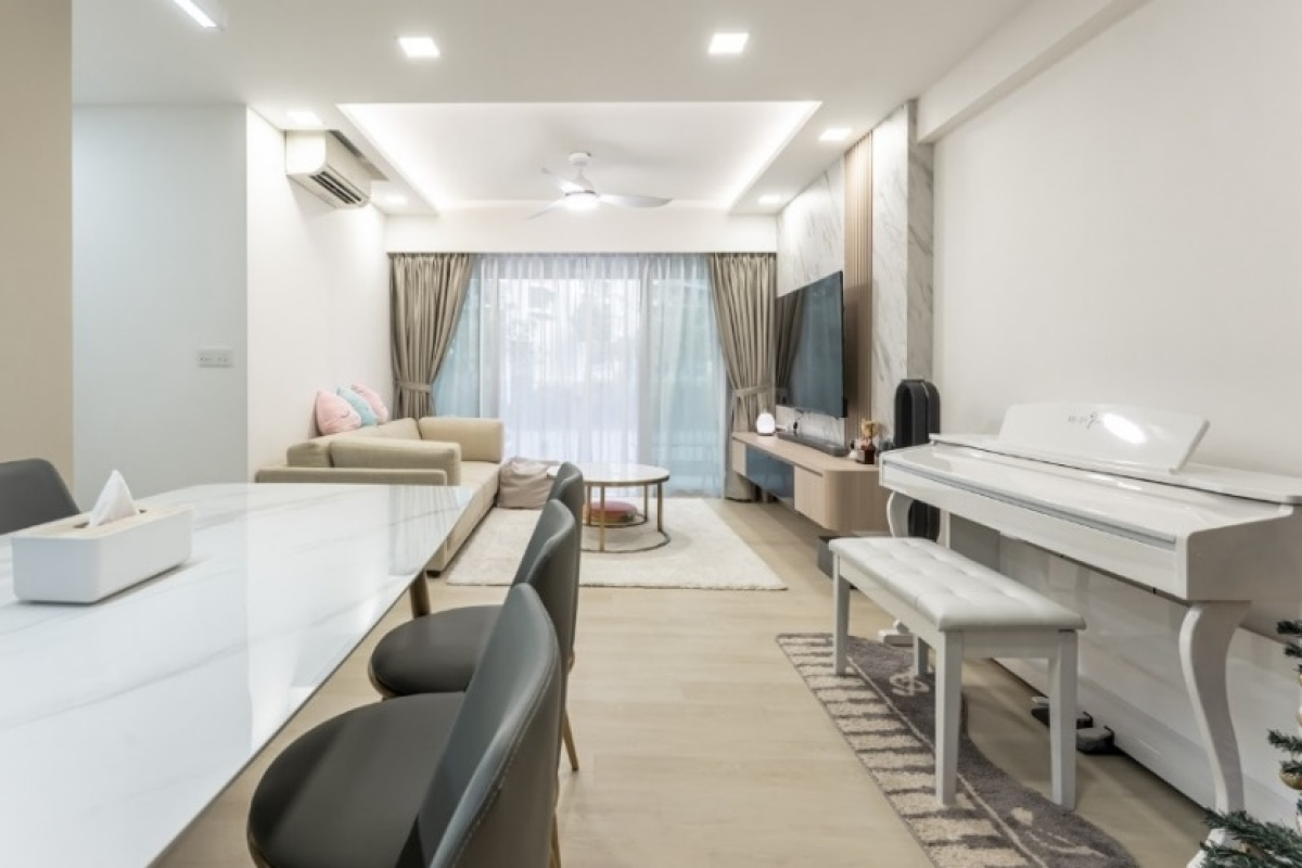
A neutral color scheme and minimalism go hand in hand. White walls and accents help create a clean slate and calming environment that works well with a minimal theme. Stick to the essentials and keep things simple and use neutral tones like whites and shades of grey to help create unity in your interior spaces.
-
No Comment Found
Mention your Requirements